The coolest collaboration of my art and events career
Working with family, working for clients, all of the iterations of the design process and of course the amazing final results.
Hello Honeycomb Homies,
I have already shared this incredible project over on my facebook and instagram feeds. Let me just say that the support and love of this design have been incredible and overwhelming.
If you haven’t seen it yet, I worked with my Brother, Aaron, on creating a stage backdrop for two of the bands he works as LD for to hang on stage during all of their stops during their tour this summer. The bands are Leftover Salmon and The Infamous Stringdusters on their Rowdy Sumer Nights Tour.
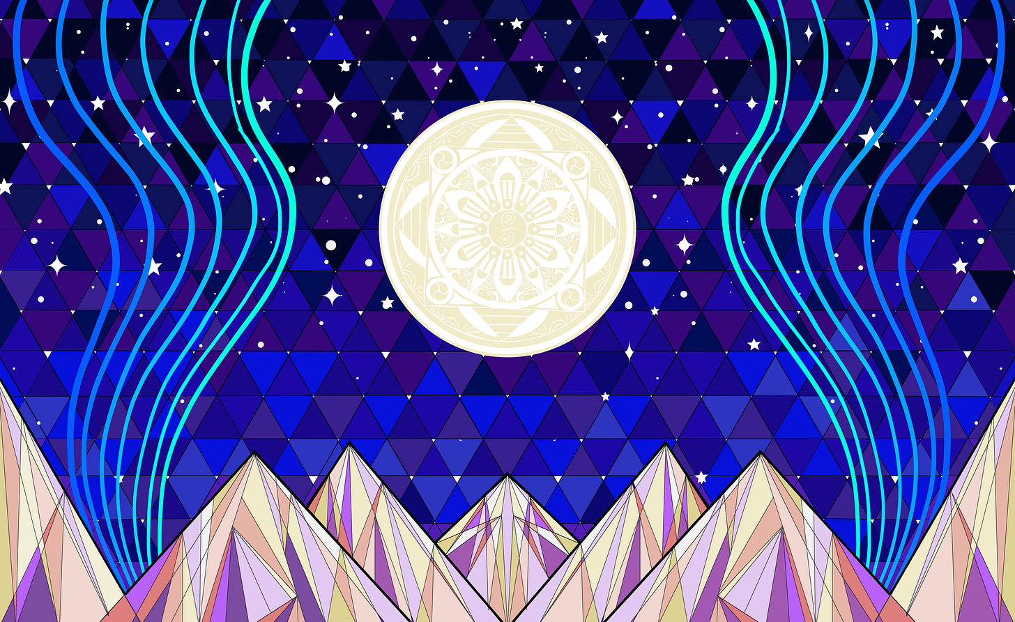
Below is the final design we created with his critiques and guidance as client and my hand on the pencil to create this incredible design.
The design concept from the beginning was to have this design divided into hanging panels with one large panel center stage and two narrower panels flanking the design creating a larger image but also each piece working alone from any crowd viewpoint.
Here’s a breakdown of the various ways this design would be able to be divided and used on various stages throughout the tour:
And here is an image I have of the design hanging on stage during the closing song druring one of their tour stops.
Now this design didn’t start out this cool. Design work like this requires so many tweaks and adjustments over the course of the design process. Things I learned how to navigate and iterate while going to university to study graphic design. You start with ideas and sketches and many versions and workups. You send some of these iterations to the client for notes and then revise the design based on those notes.
Since this was a familial collaboration I probably sent my brother more iterations of this design than I would send to other clients, but he had a strong vision for this project and I wanted his feedback more often through the design process which made this design a truly collaborative effort
Since I have been using this space occasionally to show the process of my art and design work, I pulled together an album of 9 versions this design went through before becoming the work that is currently hanging on stage behind the bands.
I will describe each image and the design notes I can remember that led us through each iteration.

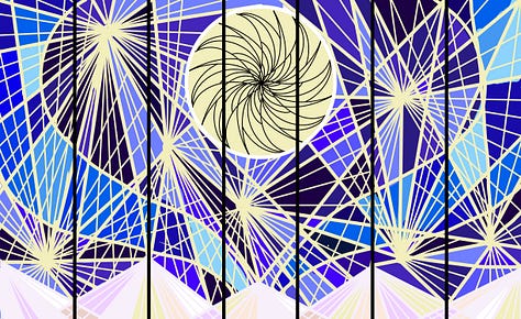
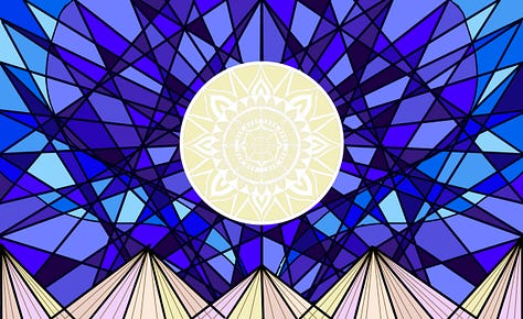

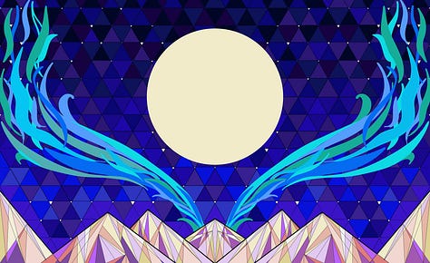

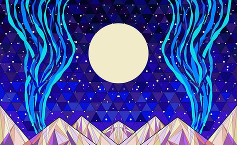
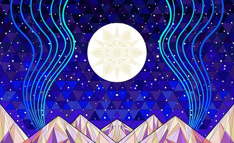

Image 1 is my initial VERY rough outline sketch. This was just based on an initial conversation and was drawn up to help align our visions and begin getting a feel for the overall layout and concept we wanted to acheive.
Image 2 was designed with the idea of primarily using lighting on the backdrop which was one of the main uses we wanted to account for. I created a hight contrast design and started getting a feel for the colors and shapes I wanted to highlight. We knew we wanted a more abstract “moon” element with a unique mandala design but this sketch was prior to designing the mandala so I just threw some rotataional shapes in the moon shape to show the effect of a mandala moon. This is version 1.0 of this design.
Image 3 is my first real efforts at refining the design to a full draft version 2.0. As you can see in the design the contrast was reduced a lot to make the design feel a lot less cluttered and chaotic, a mandala sketch was added to the moon and the abstract shapes in the sky and mountains got a lot more refined. However this deisng still needed some work, there was still too much contrast in the sky and mountains, the river elements on the sides were lost in the thick black linework and the mountains didn’t feel mountain-y enough. There was an iteration of this design where I added snowcaps to the mountains that was quickly scraped because the mountains became very pointy boobs.
In image 4 the sky and mountains were completely reworked creating what I called version 3.0. However I still needed to rework and re-add the mandala to this design, but we were more focused on this stage on getting the main elements, sky, mountains, rivers all at a place we liked before worrying about the mandala design that would be subtle in the moon as seen in version 2. Unfortiunately once I shared this design, Aaron pointed out that my sky rivers looked a LOT like antlers and he couldn’t unsee them.
Images 5, 6 and 7 are all my various attempts to de-antler-ify the design while still preserving the sky-river effect because I really liked the sky rivers and I was not willling to completely scrap them yet. Eventually as seen in image 6 I shifted the position of the rivers which definitely helped with the antler look but became too focal for secondary design elements. So I had to figure out how to tone them down. While I was working the design I realized that the rivers around the moon in a more vertical oritentation created a guitar shilouette with the moon as the center hole of the guitar which I really liked, and so did Aaron, even though we both realized that with the final design being cut into 5 panels that design feature may not translate to viewers.
Image 8 shows nearly the final iteration of the design, but Aaron wanted a bit more work on the mandala and more star-like stars so I redesigned the mandala and reduced the density of he stars and added some points to a few of the stars so they looked more starry and with those changes and a few extra lines added to the guitar-river shape around the moon. The design was finallized at version 3.5 in image 9 (and the image at the beginning of this post.
I know few designers would ever share the ugly stages of the design process like this but for me its important to be transparent and honest about my work, and showing iterations of the process like this gives the design more depth and integrty. I didn’t write out every single detailed change I made throughout this design but I wanted to highlight the more significant changes and the thought process behind them.
I also wanted to share the two more refined versions of the moon mandala, because in this design they are very subtle, but the designs of the mandalas themselves are very detailed and interestng, and I even added little banjos and mandolins into the designs.
Here are the two mandala designs featured in photos 8 and 9 above:
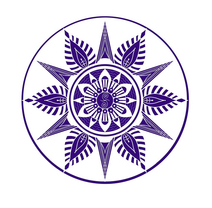

They’re definitely different from other mandalas I have designed but Aaron wanted more tibetan elements in the mandala so I referenced tibetan mandalas when chosing elements and structure for these designs.
Overall this project took dozens of hours over several weeks and was a joy and a pain to create. Any art that takes hours of time to create goes through many stages of emotion and this was no exception. However every artist has to learn how to push through the awkward, painful stages of development and trust the process to lead finally to feelings of joy and accomplishment. This design absolutely invokes feelings of pride and joy in me now and I am so honored to have been trusted with such an important project.
The tour is nearing its half-way point and there have been so many positve comments and reactions from the bands, the audience, the photographers and everyone else who has had the opportunity to see this design on tour. I can proudly say that Aaron and I absolutey nailed this project and I am so grateful to have created this design with him. I’ll leave you with a video he took from one of the tour stops of the design being lit by his lighting.
Thanks for reading about this incredible design journey! Huge thanks to my brother for bringing this project to me. Finally, thanks to everyone involved with the tour, both bands and their management teams for greenlighting this deisgn and bringing it on tour to share with so many people. What an incredible blessing this has been.
Love,
Jules


